Green Rule — Personal Website Template
Green Rule is a minimalist resume personal website template built on strict Swiss typographic rules: one scrolling page, a visible 12-column grid, black ink on paper, and a single signal-green accent used with real discipline. It is designed for the thirty-second skim a recruiter actually gives you, so the name lands first, the current role is flagged in green, and every experience entry sits on its own hairline rule where a hiring manager expects it. Nothing floats, nothing rounds, nothing gradients — structure carries the whole page.
The layout runs on a repeating 4/8 column split. The left four columns hold a two-digit index number and an uppercase Roboto Mono section label; the right eight hold the content. Experience, Selected Work, Education, and Contact each open with the same 1px ink section rule, so the page reads as one authored document rather than a stack of unrelated blocks. Dates, durations, and coordinates are set in tabular mono figures that line up down the page, which is the small detail that makes a resume feel edited rather than typed.
Everything is content-driven and easy to make your own. Swap the hero name, rewrite the four experience rows, drop in three project cards, and update the footer contact band — the grid absorbs the changes without breaking. The contact form uses underline-only inputs with a green focus line and a distinct red validation state, and the whole thing ships light-mode only because that is where resumes are read: in email, in daylight, on the way to a print dialog.
For individual professionals — designers, engineers, writers, and consultants — who want a credible one-page personal site instead of a PDF attachment. It suits anyone who is quietly job-hunting or keeping an evergreen career page, and who would rather be judged on typography and clarity than on animation. If you value a Swiss, grid-locked look over a busy portfolio, this is the template.
| Included pages | Home |
|---|---|
| Best for | For individual professionals — designers, engineers, writers, and consultants — who want a credible one-page personal site instead of a PDF attachment. It suits anyone who is quietly job-hunting or keeping an evergreen career page, and who would rather be judged on typography and clarity than on animation. If you value a Swiss, grid-locked look over a busy portfolio, this is the template. |
| Type | Website |
| Category | Personal |
| Themes | 1 |
What's included
Home
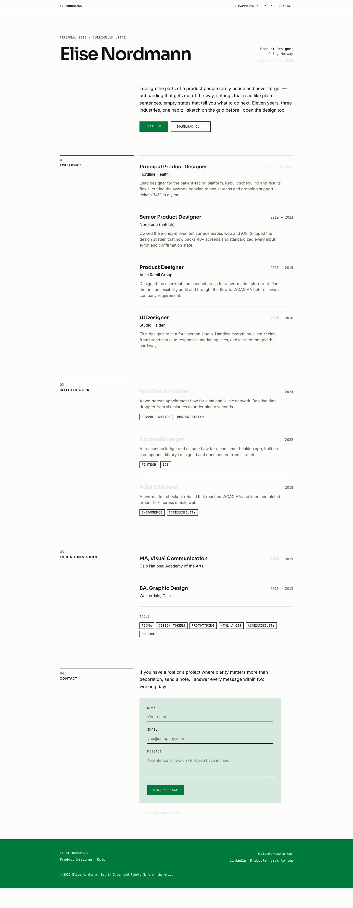
A single scrolling resume document: hero name and role, then indexed Experience, Selected Work, Education, and Contact sections, closing on an inverted ink footer band.
Key features
- The hero sets your name once in an 800-weight Inter display face, optically bottom-aligned to a full-width 1px ink rule, with role, location, and availability in tabular mono type on the same baseline.
- This is a swiss personal website template in the literal sense: the whole page runs on a 12-column grid with 24px gutters and 64px margins, and each section opens with an identical header of a two-digit index number and an uppercase Roboto Mono label above a 1px ink rule.
- The Experience block repeats a single authored row unit: job title in Inter, organization beneath it, and a right-rail date range where the current role's dates are the one green highlight allowed per section.
- Selected Work presents three project entries with a role, a year, an outcome line, and an external-link arrow, all snapped to the same 4/8 grid as the rest of the page.
- The contact form uses transparent underline-only inputs that switch to a 2px green line on focus and a 2px red line with a message on validation error, so states never rely on color alone.
- The minimalist personal website design leans entirely on hairline rules, index numbers, and white space — there are no cards, panels, shadows, or background images anywhere except the single surface block behind the contact form.
- A full-width ink footer band inverts to paper text and holds email, location, and social coordinates in mono — the single deliberate moment of inversion on the page.
- The sticky masthead carries mono nav items with an 8px green square marking the active section, and gains a drawn 1px rule under it once you scroll rather than a soft drop shadow.
Design system
Built on the Green Rule design system.
Compare personal templates
| Template | Type | Pages | Themes | Industries |
|---|---|---|---|---|
| Ink & Endpaper A literary one-page author site with a books shelf, bio, events list, and newsletter signup. | Website | 1 | 3 | Creative & Media |
| Scribble Bio A hand-drawn one-page bio with a sketch avatar, doodle link buttons, and a latest-posts strip. | Website | 1 | 3 | Creative & Media |
| Sherbet Riot A playful, vibrant one-page personal link-in-bio website with candy-bright sticker-pop styling, hard offset shadows, | Website | 1 | 1 | — |
Screenshots
Every page in the Green Rule template, plus the mobile layout.


Green Rule FAQ
Is this minimalist resume personal website template responsive on phones?
Yes. The desktop 4/8 column split collapses to a single column on mobile, with each section's index and mono label stacking above its content and page margins tightening from 64px to 24px.
How hard is it to customize the content?
It is plain content in a structured page tree — you edit the hero name, the four experience rows, three project entries, education, and the footer coordinates directly. The grid re-flows around your text without you touching layout code.
What pages and sections are included?
It is a deliberate one-pager: a hero, an Experience section, a Selected Work section, an Education section, and a Contact section with a form, ending in a full-width footer. Nav links scroll to each section anchor rather than loading new routes.
Can I change the green accent color?
You can, but the system is tuned for restraint — the signal green is capped at roughly 3% of any viewport and only marks links, focus rings, the active nav square, and one highlight per section. Any replacement should keep at least 4.5:1 contrast on the paper background.
Does it work in dark mode?
No, and that is intentional. This is a resume presented light-mode only, on a paper-white ground, because that matches how resumes are read — in email, in daylight, and on the way to print.
Which browsers does it support?
It renders on all current versions of Chrome, Safari, Firefox, and Edge. It relies only on standard CSS grid and web fonts, with no effects that need experimental browser features.
Related templates
A literary one-page author site with a books shelf, bio, events list, and newsletter signup.
A playful, vibrant one-page personal link-in-bio website with candy-bright sticker-pop styling, hard offset shadows,
A hand-drawn one-page bio with a sketch avatar, doodle link buttons, and a latest-posts strip.
A letterhead-style symposium site with call for papers, program, registration, and venue details.
A strict Swiss-grid accounting firm site with services, fixed-fee packages, and a consultation form.
A rugged expedition tour site with a trip roster, difficulty ratings, guide bios, and booking inquiry.