Sherbet Pop — Analytics Dashboard Template
Sherbet Pop is a playful ecommerce analytics dashboard template built for indie shop owners who read their sales numbers over morning coffee, not in a war room. It trades the usual grey enterprise chrome for chunky ink-outlined cards, confetti-colored charts, and a warm cream canvas, so a down day still feels navigable instead of scolding. The whole thing is light-mode on purpose — you glance at it between packing orders and answering DMs, so the numbers stay legible in a sunlit room.
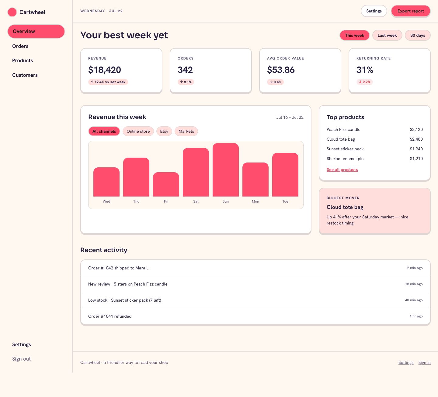
Under the candy-shop personality sits a serious app skeleton. The Overview page opens with a four-card KPI shelf, then drops into a revenue-over-time area chart with a Top products insight rail beside it. Orders, Products, and Customers each ship as a real data table with 52px rows, right-aligned mono figures, and drill-in side panels instead of modals. Every metric is set in Spline Sans Mono with tabular numbers, because a friendly dashboard still has to make its math trustworthy.
Everything is wired to swap in your own store data. Filter chips scope the charts by channel and date, trend badges flip between teal-up and danger-down automatically, and the connect-store flow in Settings shows exactly where an integration key would live. You get five working screens plus a sign-in page, all responsive down to a phone, all using design tokens so a re-skin is a variable change, not a rebuild.
Sherbet Pop is for indie and small-team ecommerce owners — a candle maker on Shopify, a two-person apparel brand, a maker selling on Etsy and their own storefront — who want their numbers to feel encouraging instead of intimidating. It suits founders who check revenue, orders, and best sellers daily but do not have a data analyst on staff. Agencies building a friendly reporting portal for boutique clients can drop their metrics straight into it.
| Included pages | Overview, Orders, Products, Customers, Settings, Sign in |
|---|---|
| Best for | Sherbet Pop is for indie and small-team ecommerce owners — a candle maker on Shopify, a two-person apparel brand, a maker selling on Etsy and their own storefront — who want their numbers to feel encouraging instead of intimidating. It suits founders who check revenue, orders, and best sellers daily but do not have a data analyst on staff. Agencies building a friendly reporting portal for boutique clients can drop their metrics straight into it. |
| Type | Web app UI |
| Category | Analytics |
| Themes | 1 |
What's included
Overview
The daily glance page: a four-stat KPI shelf, a revenue area chart with a Top products rail, and a recent-activity feed.
Orders
A filterable table of recent orders with status, channel, and total, plus a drill-in side panel for line items.
Products
Best-seller rankings with units sold, revenue, sell-through, and low-stock flags across your catalog.
Customers
New versus returning shoppers with lifetime value, order count, and last-seen dates.
Settings
Store connection, sales goals, and account preferences that power the dashboard's alerts and celebration banners.
Sign in
A single-card sign-in screen with email and password fields matching the app's ink-outlined input style.
Key features
- The Overview page leads with a four-card KPI shelf — Revenue, Orders, Average order value, and Returning customer rate — each with a mono figure and an up/down trend badge that recolors itself, which is the centerpiece of the whole playful analytics dashboard design.
- A revenue-over-time area chart pairs with a Top products insight rail, so you see the trend and the reason for it on the same screen.
- The Orders table lists 10 real orders with status pills, channel, and totals, and each row opens a 420px side panel with the line items instead of a jarring modal.
- The Products page ranks best sellers with sell-through, units, and stock-left columns, flagging low stock in a danger badge before you run out mid-sale.
- A Customers table splits new versus returning shoppers with lifetime value and last-order dates, so you can spot your regulars at a glance.
- Filter chips above every chart scope the view by sales channel and date range, wrapping into a friendly pill row rather than a cramped dropdown.
- The Settings page includes a Connect store panel showing where your Shopify or Etsy key goes, plus goal targets that drive the celebration banners.
- Every screen is responsive to phone width, with the sidebar collapsing and the 8-column chart stacking above its insight rail below 1024px.
Design system
Built on the Sherbet Pop design system.
Compare analytics templates
| Template | Type | Pages | Themes | Industries |
|---|---|---|---|---|
| Hushline Queues A calm sage call center dashboard with live queues, agent status, SLA stats, and daily reports. | Web app | 7 | 3 | Technology & SaaS, Professional Services |
| Scanline Ops A phosphor-green CRT ops console with uptime tiles, service health, an incident timeline, and a live log tail. | Web app | 7 | 3 | Technology & SaaS, Logistics & Operations |
| Voltglass Ticker A neon dark trading cockpit with live ticker rails, dense market grids, and price alerts. | Web app | 7 | 3 | Finance, Technology & SaaS |
Screenshots
Every page in the Sherbet Pop template, plus the mobile layout.


Sherbet Pop FAQ
Is this playful ecommerce analytics dashboard template responsive on mobile?
Yes. The 240px sidebar collapses on small screens, the KPI shelf reflows to a single column, and the 8-column revenue chart stacks above its insight rail below 1024px, with 16px page padding under 768px.
How hard is it to swap in my own store's colors?
Every color is a design token, so re-skinning is a variables change rather than a component rewrite. The coral, teal, and sunshine roles are named, so you can point them at your brand and keep the ink-outlined sticker style intact.
Which pages are included?
Six screens: Overview, Orders, Products, Customers, Settings, and a Sign in page. The first four share the same header nav, and Orders demonstrates the slide-in side panel used for drill-downs.
Can I connect real data like Shopify or Etsy orders?
The Settings page includes a Connect store panel that shows exactly where an integration key lives, and every table and chart is structured around fields — order total, units sold, channel, date — that map directly to a typical ecommerce feed.
Does it work across modern browsers?
Yes. It uses standard Tailwind layout and design tokens with no exotic CSS, so it renders consistently in current Chrome, Safari, Firefox, and Edge.
Is the colorful analytics dashboard template accessible?
Text and background pairs are chosen to hit 4.5:1 contrast, numbers use tabular mono for alignment, trend colors are paired with up and down glyphs rather than color alone, and every interactive element carries a visible focus ring.
Related templates
A calm sage call center dashboard with live queues, agent status, SLA stats, and daily reports.
A neon dark trading cockpit with live ticker rails, dense market grids, and price alerts.
A phosphor-green CRT ops console with uptime tiles, service health, an incident timeline, and a live log tail.
A dark, hazard-striped factory console for tracking line OEE, machine status, quality, and downtime at a glance.
A dark-slate finance console with mono KPI numerics, a markets grid, and dense positions tables for portfolio teams.
A calm sage-green clinical dashboard for daily patient metrics, roster review, and outcomes trend tracking.