Modern Social And Community — Community App Template
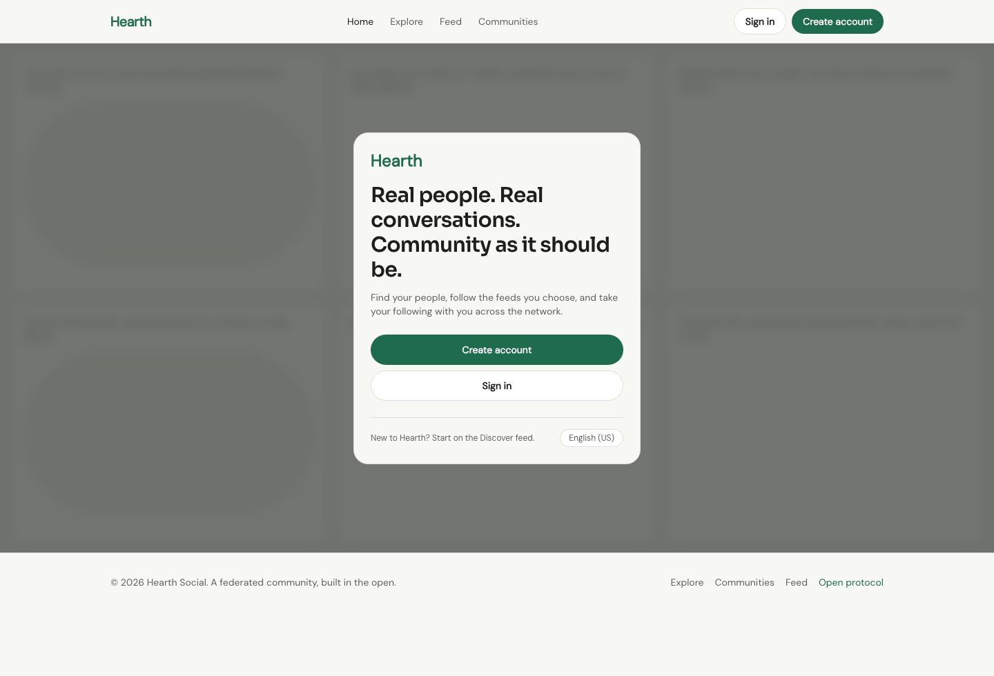
The Modern Social And Community community app template ships the signed-out home the way a federated network actually builds one: a single auth card floating over a dimmed, blurred timeline of real posts, with no marketing hero, no feature grid, and no pricing band. The saturation budget is spent on exactly one blue pill — the Create account button — while every other control on the page resolves to a quiet full-pill in slate-on-white. It reads as a live product on first load, not a brochure about one.
Behind that modal sits a working app mock. The Feed page opens with a composer and eight authored posts, each in a 12px card with a fully-rounded photo attachment, a handle, a timestamp, and reply, repost, and like counts. Explore swaps between named feed columns — Following, Discover, Photography, Local — through pill selector chips, and Communities lists nine joinable groups with member counts and a Join button. The header nav stays identical across all six pages so the shell never shifts underfoot.
Typography is a single InterVariable face from the 30px modal headline down to the caption-sized post meta, so weight and size carry the whole register instead of a display swap. Radii are deliberate: 21px on the auth modal, 12px on feed cards, and 999px on every interactive pill, which keeps the chrome-versus-content boundary legible without a third radius in between.
This template is for founders and product teams launching a federated or interest-based community network who want a signed-out home that shows the feed rather than describing it. It suits designers who need a working app mock — timeline, explore, and communities — wired together before backend work begins. It also fits agencies rebuilding a social product on the restrained pill-and-photo aesthetic of a modern social feed.
| Included pages | Home, Explore, Feed, Communities, Sign in, Create account |
|---|---|
| Best for | This template is for founders and product teams launching a federated or interest-based community network who want a signed-out home that shows the feed rather than describing it. It suits designers who need a working app mock — timeline, explore, and communities — wired together before backend work begins. It also fits agencies rebuilding a social product on the restrained pill-and-photo aesthetic of a modern social feed. |
| Type | Web app UI |
| Category | Social & Community |
| Themes | 1 |
What's included
Home
A single auth modal floating over a dimmed, blurred feed wash, with a Create account pill, a Sign in link, and a language chip.
Explore
Pill selector chips over a grid of suggested feeds plus a who-to-follow rail with handles and follower counts.
Feed
A post composer above a timeline of eight authored posts with photo attachments, handles, timestamps, and engagement counts.
Communities
A grid of nine joinable communities showing member counts, short descriptions, and full-pill Join buttons.
Sign in
A centered sign-in card with handle and password inputs, a blue primary button, and a link across to Create account.
Create account
An account-creation card with email, handle, and password fields, a blue Create account button, and a link back to Sign in.
Key features
- The Explore page groups feeds into named columns — Following, Discover, Photography, and Local — each a full-pill selector chip that swaps the suggested-feed grid beneath it.
- Every post in the Feed renders inside a 12px card with a fully-rounded photo attachment, a handle, a timestamp, and reply, repost, and like counts drawn from realistic data rows.
- The signed-out Home collapses the entire marketing surface of this social and community community app into one 21px auth modal floating over a scrimmed, blurred photo-feed wash.
- The Communities page lists nine joinable groups with member counts, a one-line description, and a pill-shaped Join button that carries the same modern community app design language used across the shell.
- Sign in and Create account are separate flow pages with full-pill inputs, a single blue primary CTA, and a language-selector chip pinned to the footer.
- A composer sits at the top of the Feed with an avatar, a text field, and an attach-photo control, so the timeline reads as a live app instead of a static screenshot.
- Post-meta timestamps, repost counts, and attribution lines use the steel-grey caption role, keeping each card dense without crowding the body text.
- The header nav — Home, Explore, Feed, and Communities — stays identical on every page, with Sign in and Create account pinned to the right.
Design system
Built on the Quietline design system.
Compare social & community templates
| Template | Type | Pages | Themes | Industries |
|---|---|---|---|---|
| Charter Careers A boardroom-formal job board with salary-band listings, structured job detail, and an application tracker. | Web app | 6 | 3 | Professional Services, Technology & SaaS |
| Host Desk A playful door-duty console for event hosts, with live arrival tracking, attendee badges, and announcements. | Web app | 6 | 3 | Events, Hospitality, Creative & Media |
| Jellybean Commons A candy-bright forum UI with a board index, threaded discussion view with reactions, and member profiles. | Web app | 6 | 3 | Technology & SaaS, Creative & Media |
Screenshots
Every page in the Modern Social And Community template, plus the mobile layout.


Modern Social And Community FAQ
What exactly does this template include?
This modern social and community community app template ships six pages — Home, Explore, Feed, Communities, Sign in, and Create account — wired as a working app mock rather than a single screenshot. Each page shares one header nav and one footer, so the shell stays consistent as you navigate.
Is the layout responsive?
Yes. The nav collapses on small screens, the community and explore grids reflow from three columns down to one, and the auth modal stays centered and readable at every width using Tailwind breakpoints.
How hard is it to change the colors?
Every surface uses design tokens like bg-primary, bg-card, and text-muted-foreground rather than raw hex, so re-theming is a matter of swapping the token values. The single blue accent is intentionally reserved for the primary CTA to keep the palette disciplined.
Can I connect it to my own backend?
The posts, communities, and follower counts are plain markup you can replace with data from any API or database. Handles, timestamps, and engagement counts are structured as repeated card rows, which map cleanly to a list rendered from real records.
Which browsers does it support?
It targets current versions of Chrome, Safari, Firefox, and Edge. Layout relies on standard CSS grid and flexbox, so it degrades gracefully on slightly older releases.
Does the design work for interest groups, not just a general social feed?
Yes — the Communities page and the Explore feed chips make the modern community app design equally suited to a hobby network, a local neighborhood app, or a professional interest group.
Related templates
A candy-bright forum UI with a board index, threaded discussion view with reactions, and member profiles.
A boardroom-formal job board with salary-band listings, structured job detail, and an application tracker.
A playful door-duty console for event hosts, with live arrival tracking, attendee badges, and announcements.
Cream-and-terracotta HOA portal UI with announcements, amenity booking, and a document library for residents.
An industrial agent-ops console UI with fleet status, workflow graphs, run history, and live logs.
A calm, paper-toned AI chat UI with a focused thread, history sidebar, and saved prompt library.